Reports and Insights
Reports show you patterns in how you spend your time. Use them to spot which days were most productive, whether you're improving week over week, and where your time actually goes versus where you think it goes. If you are new to the app, read Getting Started and Your Dashboard first.
Open Reports from the popover's View Reports link, the right-click menu, or the global hotkey configured in Settings.
Today Tab
The daily view gives you a complete picture of a single day.
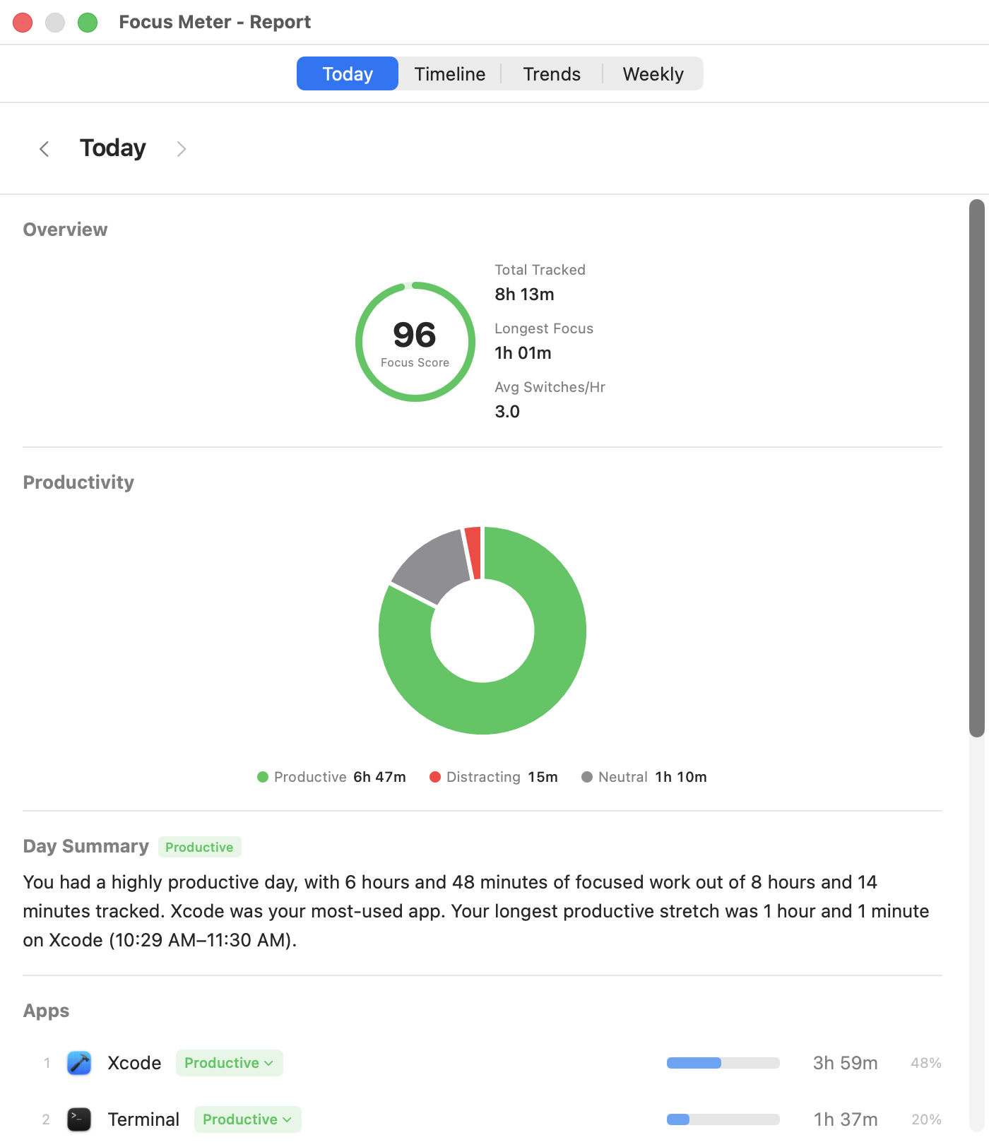
What you'll see:
- Date navigation: arrow through past days to compare
- Summary stats: tracked time, app switches, longest focus, idle time
- Productivity donut chart: a visual split of Productive vs. Distraction vs. Neutral time
- App ranking: every app you used, sorted by duration, with percentages
- Website ranking: if browser tracking is on, a separate list of domains with their own categories and durations
- Category badges: you can re-categorize apps and domains directly from this view
When to use it: Check this at the end of your day for a quick review. If your productive percentage is lower than expected, scroll through the app list: you'll usually spot the culprit quickly.
Tip: If a browser like Chrome shows a lot of time, look at the website ranking below it. Browser time is split by domain, so you'll see exactly which sites were productive and which were distracting. The app-level entry alone won't tell the full story. See the Chrome tracking guide and the browser usage guide for setup and examples.
Timeline Tab
The Timeline shows your day as a visual sequence of colored blocks, divided into four segments:
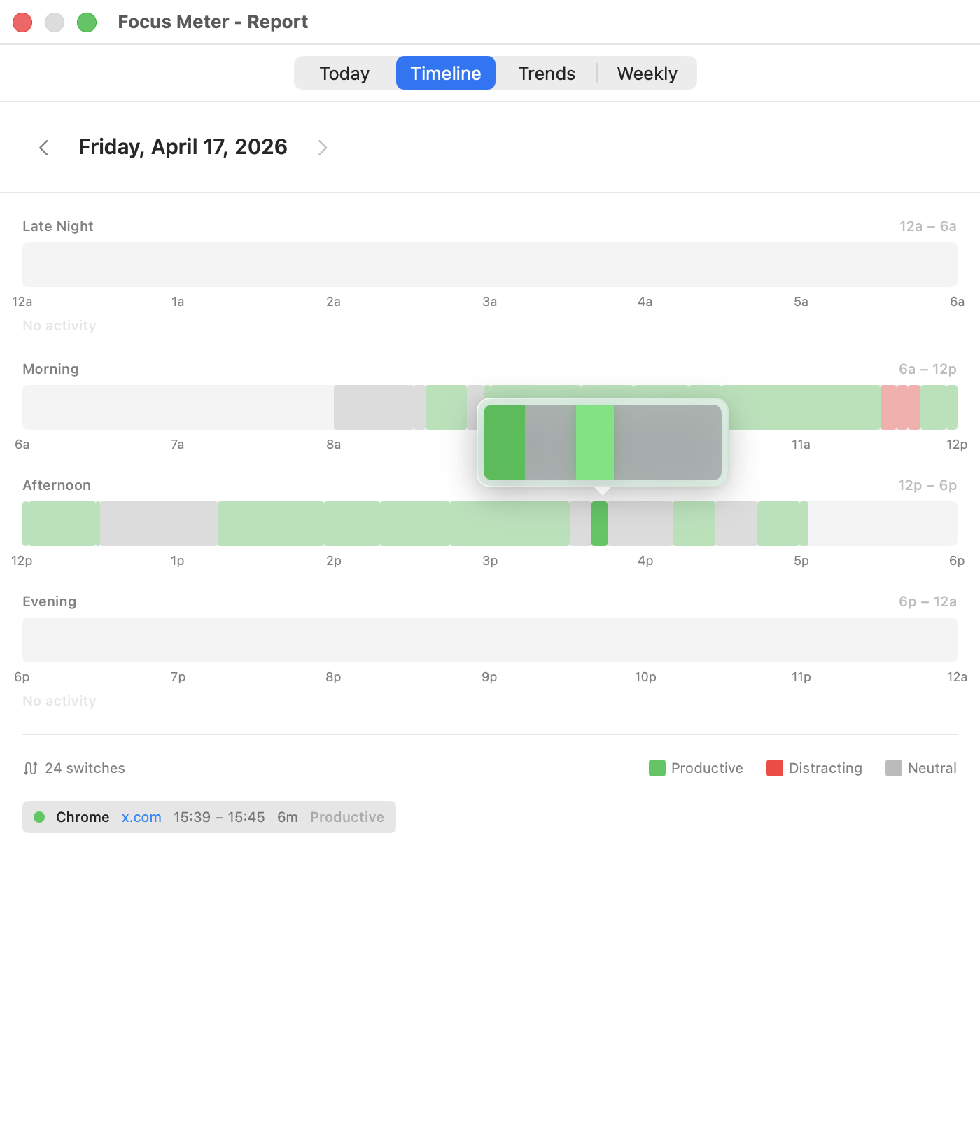
- Late Night (12am - 6am)
- Morning (6am - 12pm)
- Afternoon (12pm - 6pm)
- Evening (6pm - 12am)
Each block is color-coded by productivity category. Hover over any block to see the app name, duration, and time range.
When to use it: The Timeline is the fastest way to spot context-switching clusters. If you see rapid color changes in a segment (lots of short blocks), that's a stretch where you were bouncing between apps. Long solid blocks mean deep focus. For the behavior behind those clusters, read The Real Cost of Context Switching.
Tip: Compare your Morning and Afternoon timelines. Many people find their best focus happens in the morning, with more switching in the afternoon. If that's you, schedule your most important work accordingly. The guide to finding your most productive hours turns this into a repeatable weekly review.
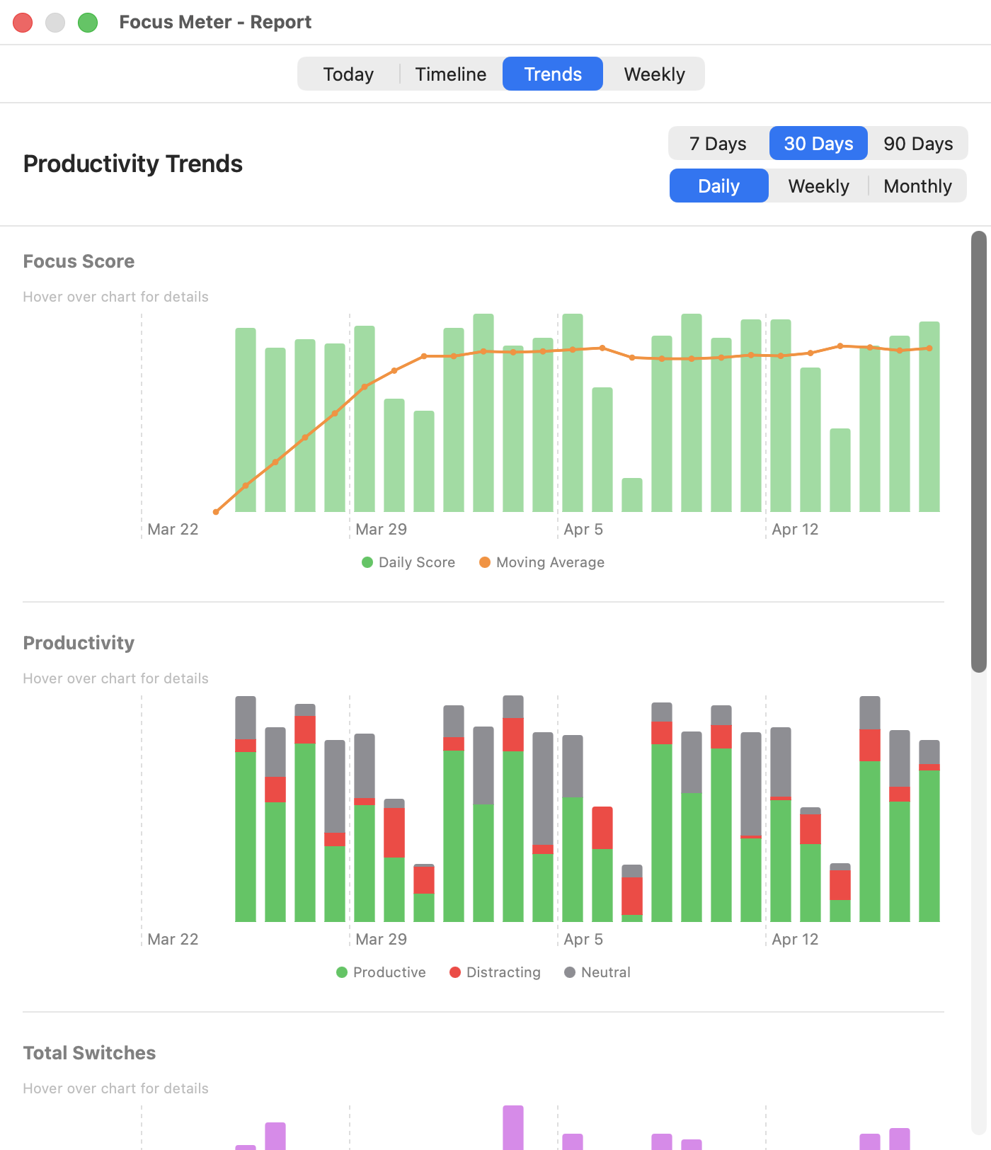
Trends Tab
Trends let you zoom out and look at patterns across days, weeks, or months.
Controls:
- Range: 7 Days, 30 Days, or 90 Days
- Granularity: Daily, Weekly, or Monthly (for summarizing data points)
Charts included:
- Focus Score: your daily score with a moving average line to show the overall direction
- Productivity split: stacked chart showing Productive, Distraction, and Neutral time per period
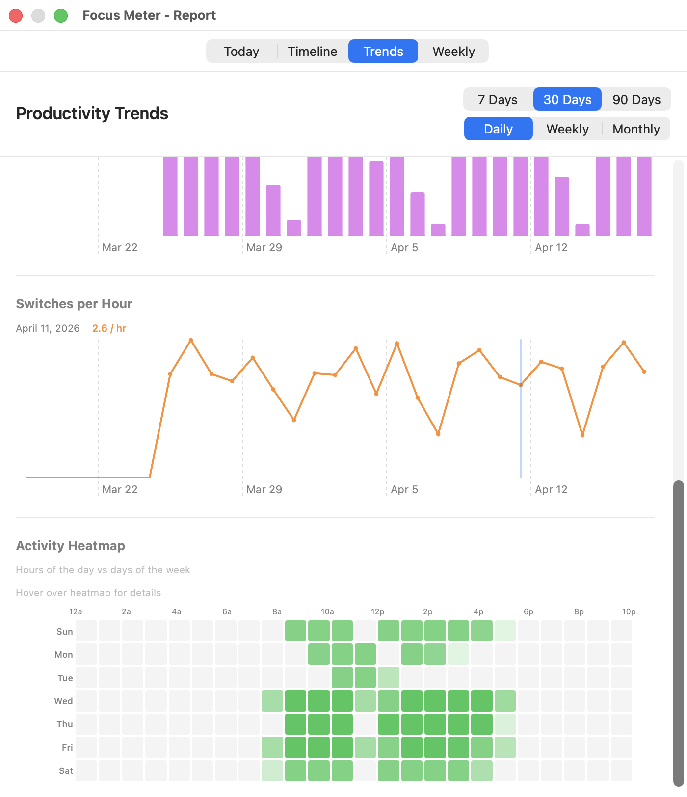
- Switches: total app switches and switches-per-hour (a normalized view that accounts for days with different tracked hours)
- Activity heatmap: hour of day vs. day of week, showing when you're most active
When to use it: After your first week, check the 7-day view to see if your score is trending up. After a month, switch to 30 days with weekly granularity to see week-over-week improvement. If the score itself feels unclear, read What Is a Focus Score?.
Tip: The activity heatmap is useful for understanding when you work, not only how. If your most active hours don't overlap with your most productive hours, consider shifting your schedule. For role-specific examples, browse the profession guides.
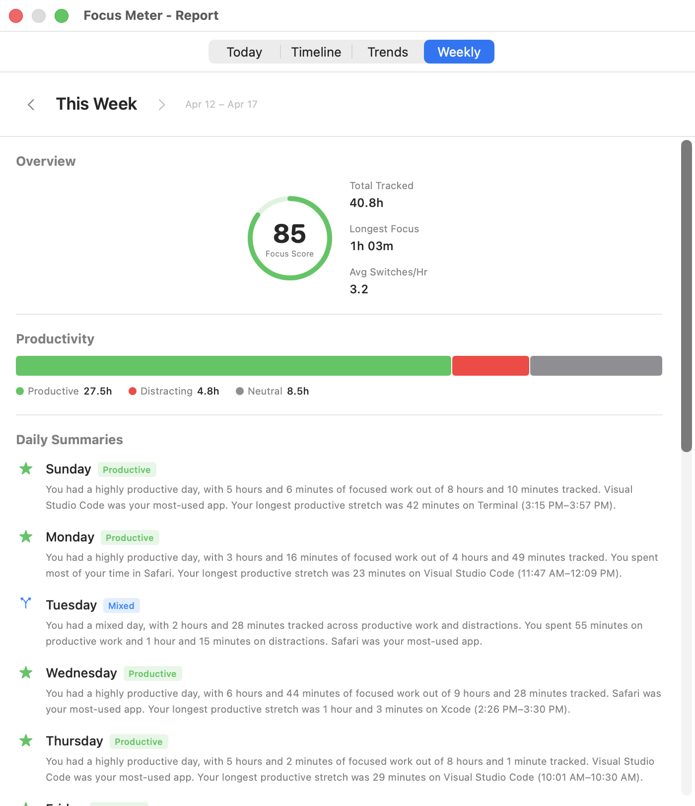
Weekly Tab
A structured summary of the past seven days, designed for a weekly review.
What you'll see:
- Overview metrics: total tracked time, longest focus session, total switches, average session length
- Productivity breakdown: percentage split across categories
- Best focus day: which day you scored highest
- Trend vs. previous week: whether you improved, declined, or stayed steady
- Daily summaries: a row per day with key stats
- Ranked activity: top apps and sites for the week
When to use it: Set a weekly reminder (Friday afternoon or Monday morning) to review this tab. It's the best single view for tracking progress over time without getting lost in daily noise. Use Export and Sharing when you want to save the weekly data or share a Focus Card.
Related Guides
- Your Dashboard: read the live numbers before they become report history.
- Settings and Privacy: tune goals, categories, browser tracking, and idle detection so reports stay accurate.
- Export and Sharing: archive report data as CSV or JSON, or generate a weekly Focus Card.
- Troubleshooting: fix missing URL data, surprising idle time, or confusing app entries.